A very neat and bright portfolio site: http://work.limbertfabian.com/
Colorful motion graphic he did : http://work.limbertfabian.com/FRESHWORKS-2-0
Light peppermint green tone refreshes the visual and provide comfortable and positive looking.
Short animation, mood perfectly with music beats and color, really cute!
http://vimeo.com/38562069
Making of: http://vimeo.com/38563523
From character design, scene development, style frame to final animation.
Amazing process! Really hard work behind the 20 seconds.
2012年4月8日 星期日
2012年3月26日 星期一
Shape as message and connecting element
http://vimeo.com/38142903
The round element go throughout the whole advertisement. Smooth transition, also conveys the benefits of the tire.
SIMPLICITY, stop-motion:
http://vimeo.com/37938158
http://vimeo.com/8551195
The round element go throughout the whole advertisement. Smooth transition, also conveys the benefits of the tire.
SIMPLICITY, stop-motion:
http://vimeo.com/37938158
http://vimeo.com/8551195
2012年3月4日 星期日
Geometrical composition and transitions
http://www.superestudio.tv/s_w_nat_geo_2.html#
dynamic visual composition using layers of rectangles.
Horizontal and vertical transitions, following music beats.
make it fairly easy to follow although going very fast.
successfully conveying the vivid aspects of wildlife in National Geographic program.
duo tone color scheme with complementary bright colors.
Stay colorful while avoiding noisiness.
layering of images creates visual depth.
Central Park Mood reference
http://vimeo.com/16617991
I took a bunch of pictures in Central Park on Friday.
Since it's winter time, leaves are gone and grass turned pale.
Only tree branches over my head and cold breeze in the air.
It's chilly relating to my Central Park theme.
I found this video recording light in the daytime in CP, I believe in late spring or early summer,
the color looks so vibrant and calming as well.
Fits so much better with my theme...
Fun Motion Graphics
http://www.gelatin.se/quicktime_s3/Cloudmachine.mov
I love its dynamic scene transition, such as camera pan, zoom out, changing focus etc.
However, it's kind of a stereotype just-want-to-catch-eye movie.
2012年2月18日 星期六
Textured typography
Cool.
Here's another simple video by Nessim Higson.
http://vimeo.com/36365955
I love the texture of the letters, like old school signage style.
Also the copy write is clever: "Less always wins more, or less always wins more or less."
2012年2月12日 星期日
Tasty motion graphics
http://curtisbaigent.com/#1581646/Best-Use-of-Exploitative-Tactics
Really good color expression and animation skills...
Graphic style is a really important part of animation..
Really good color expression and animation skills...
Graphic style is a really important part of animation..
2012年2月5日 星期日
information visualized
This is not a video done by flash or aftereffect. I think it is done by hand drawing and a camera.
It organizes the academic content into funny drawings and key notes, and make it fairly easy to understand. In our assignment one, I find it hard to transit from one scene to another, go from one point to another, While this video transit between different points smoothly.
I am also fascinated by the hand drawn quality.
I think it a cool motion graphic video explaining the crisis of credit in a vivid way. By a closer look, I find the use of arrows really helps clarifying the relationship of different characters.
The style of vector graphic is humorous and interesting.
2012年1月29日 星期日
2010年4月13日 星期二
Interactive music video
http://www.beonlineb.com/
Looks like an old movie, but have weird elements in it.
Just click around and interact with the handsome singer (who looks a bit like Elvis Presley).
The whole atmosphere created by the music and visual is entrancing, and I think applying interactive flash clips to music video production is clever, since the budget is not so high while the content attracts eye balls.
Make a flake
http://snowflakes.barkleyus.com/
It's fun! I retrieved my childhood memories cutting numerous kinds of paper flakes, and all of them appeals to me.
The execution of this flash game is easy and user-friendly. The color tone is nicely soft and comfortable.
And I wish I could know what the actionscript is...
It's fun! I retrieved my childhood memories cutting numerous kinds of paper flakes, and all of them appeals to me.
The execution of this flash game is easy and user-friendly. The color tone is nicely soft and comfortable.
And I wish I could know what the actionscript is...
2010年4月6日 星期二
Pattern Pattern Patterns
http://patternfoundry.com/
This is another site done by Courier font.
And the pattern swatches are placed layer by layer loosely.
The viewing experience is a bit like choosing different fabric.
Basic and useful.
This is another site done by Courier font.
And the pattern swatches are placed layer by layer loosely.
The viewing experience is a bit like choosing different fabric.
Basic and useful.
Peace Shadow project
http://peaceshadow.net/
It a Japanese site introducing their suffering from the nuclear bomb by the U.S, and to arouse people's awareness of world peace. The website is nice, the opening is eye-catching, also the girl's English in Japanese accent conveys certain kind of mood.
Japanese think the nuclear bomb was unhumane, unpeaceful, so what about Chinese, thinking of the massacre done by them?
Overall, it a good design. The interview videos are placed in a pleasing format, the bold font corresponds to the theme.
2010年4月5日 星期一
Mysterious interaction
http://www.gaite-lyrique.net/experience/
I love the opening movie and its music so much! It sweeps off my impression of 3D animation as unhuman and too technological . I enjoy watching this , all 4 times.
However, when it comes to interactive part, I have to say it spoiled all my patience. I click and click and nothing seems to respond, and finally I found that it only respond to cursor moves and that is all. I expect much more than this.
However, I still want to watch the opening over again.
"Every morning I check Many Stuff"
http://www.manystuff.org
This is another site with Courier font and a simple style.
The content layout is much more pleasing to eyes, compared to the former site I introduced. The text font and word space are just right that we read it through smoothly, even though the alphabets themself are surprisingly small.
By the way, it looks so French French!
Casual Poet
http://casualpoet.com
This site is for Casual Poet studio in Singapore, which is the first site I don't see any pictures. And the font is the most basic Courier.
I don't know whether it is the style they intend to show or the casual poets are too casual and lazy to add pictures or change font.
Without clear sections and empty space, the site content is really hard to read. You don't expect audience to read a website like reading poems.
2010年4月4日 星期日
A simple site
http://www.tithi.info/new/main.htm
This is a showcase of a jewllery artist.
The only interaction is clicking on icon and content unfolds, which is rather traditional.
I like the way to enlarge a picture by click on it, and the enlarged one take up the horizontal space and would not harm the overall site layout. While in many other site, the larger version always brings out another browser window, which is annoying to me.
As an artist's showcase, I deem this site worth studying.
2010年4月3日 星期六
Css or Actionscript?
http://csszengarden.com/?cssfile=/213/213.css&page=0
This is a static site created by CSS language. Nothing blinks, nothing moves, nothing swings.
Users simply scroll the middle mouse button to see the whole page.
However, I don't find the site boring at all. It's like an old mysterious textbook (maybe of a grandpa or grandpa's grandpa), one would look cautiously and carefully study the traditional style photos and illustrations. It gives me a feeling of authority and worth of respect.
Besides, the static content makes the site totally controllable. No thinking, no confuse, no mistake, no missing information.
Is the future CSS's or Actionscript's?
Walking in virtual reality
http://www.2gh.de
It loads slow, please be patient.
It is a nicely decorated space, with abundant lightsource, which makes everything look light and inviting. (Perhaps it's photoshopped?)
The color squares floating in the air make this space magical in the first-person perspective. It's like entering a nice little cafe with a bit background music, beautiful handicrafts on wall or on sofas. One could not help wandering around and have a look at everything.
The cube design is also amazing. However, it's a bit confusing to a first-time user like me.
By the way, it loads really slow... May scare away many potential audience...
2010年4月2日 星期五
Coca-Cola or Illustration?
http://plus.cocacolalight.com.br/plus
Turning a mouse cursor into a drawing pen is not unusual these days. I simply love this interaction, since I love doodling.
What I find this amazing is that whatever you draw wherever on the screen, the code would generate a line right from your drawing. And the line smoothly introduces a series of cool illustrations. This is an interesting interaction and I keep playing with it. But still have not tried out all versions.
Besides, the illustrations are simple and elegant, which makes the cola site more like an illustration site or some art thing, which, I think is good.
My own review on Actionscript code learnt
Var XXX:YYY=new YYY();
"var" is to set a variable XXX, which is a subset of YYY (YYY is a group name).
":" means "property or attribute".
XXX.addEventListener("ZZZ",AAA);
If ZZZ is completed, then excute AAA.
"." means 's .
"var" is to set a variable XXX, which is a subset of YYY (YYY is a group name).
":" means "property or attribute".
XXX.addEventListener("ZZZ",AAA);
If ZZZ is completed, then excute AAA.
"." means 's .
Another Japanese site
http://www.muji.com/rhythm
Another Japanese site of Muji.
I don't know if you like the Muji simplicity. To me, I dislike most of the products except stationary, especially the color pens. I imagine putting everything in gray, brown grey, blue grey etc at home would be dreary.
I deem this site design-oriented rather than showing off coding or technology. Every product on screen is aligned to some kind of grid and jumps slightly, or switch among themselves dynamically to a heart-beat rhythm. It clearly reveals the designer's attention to give a vivid life to these products.
The interaction between the mouse cursor and the buttons seems to be diminished by the beating pictures themselves. However, it still fairly easy to use (simply double-click and enter a detailed page of a product), and successful keep the user's interest in this site and follow the rhythm unconciously.
However, the heart-beat itself scares me a little. Since it is so clear and distinctive, I cannot help thinking of a dying human.
2010年3月9日 星期二
Interactive website of Grey Group Japan
Check this!
http://greygroup.jp/greyshines
I love the way all characters in paper puppet form wearing color pencil texture, and their movements look dynamic and organic. I guess the web designer has add some special actionscript codes to control such rhythmic body movements.
You can also switch between different moods of the characters by pressing "G" key, and they even have MJ's moonwalk dance, amazing!
However, I don't like the way the alphabets changing and flashing when the mouse arrow goes over the words. It makes me dizzy.
In general, I like it.
2010年3月3日 星期三
iPhone Crossover "Helicopter"
check this on youtube
http://www.youtube.com/watch?v=V3KrFV0-WFw&feature=player_embedded
Most of us have been used to playing racing car games in iTouch or iPhone, by simply turn and swing the machine, like controling an steering wheel.
What about remote control a camera-equipped toy helicopter, in the mean time enjoying the bird-view scene sent to the iPhone? I have never thought about that. But it definitely should be fun!
The interactive navigation I choose is carried out in real life, instead of in cyber world, which may not be appropriate for this assignment. However, this kind of interaction between human and machine, or machine and machine, appeals to human nature that everyone loves to play and
wishes to experience flying. Thus I deem this magic toy helicopter inspirational for interactive design.
2009年11月12日 星期四
Auction Report 3
Promotion Result
According to our last auction report, we need to get more attention by facebook, MSN signatures, e-flyers and web forums:
e-flyer:
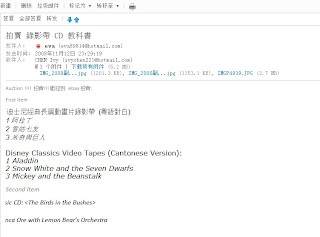

 Facebook:
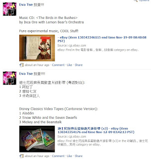
We also ask our friends directly to go to the links on ebay, to increase the view rate of our products.
Before asking anyone, the view rate on ebay is always zero for the first few days. After asking our friends, the view rate increased a lot, we gain 30-40 in one night after asking friends through MSN, facebook and e-mails.
Selling Result
 As we work on the auction, we changed our decisions,
we add an item of Disney Video Tapes since we think this can get sold very quickly.
For the Disney Video Tapes
We sold it for only $1
It was the first item we sold. It was quick to sell this item, but soon we regreted. We actually should sell it at a much higher price. Therefore we set a higher price for the product CD.
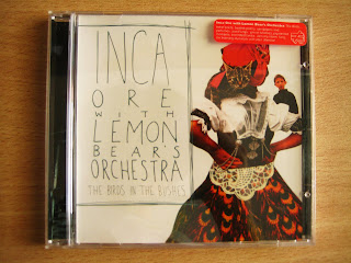
At last, we have sold the CD at $41 via ebay.
How to Improve
1. We should use more attractive e-flyer, using more graphics,
2. We should increase the basic bidding value.
3. We should use Yahoo! Auction as it is more common in HK.
According to our last auction report, we need to get more attention by facebook, MSN signatures, e-flyers and web forums:
e-flyer:


MSN signature:
 Facebook:
We also ask our friends directly to go to the links on ebay, to increase the view rate of our products.
Before asking anyone, the view rate on ebay is always zero for the first few days. After asking our friends, the view rate increased a lot, we gain 30-40 in one night after asking friends through MSN, facebook and e-mails.
Selling Result
 As we work on the auction, we changed our decisions,
we add an item of Disney Video Tapes since we think this can get sold very quickly.
For the Disney Video Tapes
We sold it for only $1
It was the first item we sold. It was quick to sell this item, but soon we regreted. We actually should sell it at a much higher price. Therefore we set a higher price for the product CD.
At last, we have sold the CD

How to Improve
1. We should use more attractive e-flyer, using more graphics,
2. We should increase the basic bidding value.
3. We should use Yahoo! Auction as it is more common in HK.
2009年10月8日 星期四
Auction Report 2
Promotion Strategies:
1. Via Internet
1. Via Internet
- Facebook: Post the information on our facebook sites, so some of our friends, friends of friends, and other people linked may approach to the items we sell and perhaps feel like buying them.
- E-flyers: Send emails to contacts and inform them of our items for sale. (avoid composing email like junk mail, be careful about tone of voice and wording)
- MSN signature: Put the info on MSN signature and keep updating, as MSN users naturally scan through the signatures of friends’ every day.
- Web forums: Post the info of used text books& past papers for A-levels on some student forums, as many form7 students are seeking for study materials of past years via web forums. This strategy directly approach to a large group of buyers.
2. Via Friends& Acquaintance
Sell them directly to people in our life.
Selling Platform
Ebay for HK market& overseas market
Taobao for Mainland China market
2009年9月24日 星期四
Auction Report
The items we are going to sell can be categorized to 3 kinds, and all items could be traded in 2 ways: sold OR bartered.
1. Some unused/second-handed personal belongings


1. Some unused/second-handed personal belongings
- A set of textbooks of advanced Mathematics (Chinese version, brand-new)
- An English vocabulary book (Chinese version, brand-new)
- Special edition of Apple Daily: new trends of Paris and Milan fashion (brand-new)
- A carnelian bracelet (brand-new)
- "The Birds in the Bushes" CD album of Inca Ore with Lemon Bear's Orchestra (experimental music, 90% new)
- Toys (limited edition during certain periods) of 7-Eleven or Circle K shop (80% new)
2. Sell-Our-Wild-Art items (mainly for fun, not money)
- Gather air of different places and situations, e.g. fresh air from sunny beach, noisy air from Mongkok, or even somebody’s fart etc. And keep them in cans. Upon opening these cans, one will have a specific sense of certain smell.
- Take pictures of various people laughing/smiling, and record their laughter/voice as well for sale. We simply “sell laughter/smile”.
3. Original design products
- Graphic tees of original design


- Hand-drawn postcards (produced after ordering)
訂閱:
意見 (Atom)